✨ New article: Psychology of UX Writing.
Join us as we learn, share
& grow together.
Become a member and unlock all our educational content,
extra community perks, and early access.
extra community perks, and early access.
We are an educational partner of the Interaction Design Foundation.
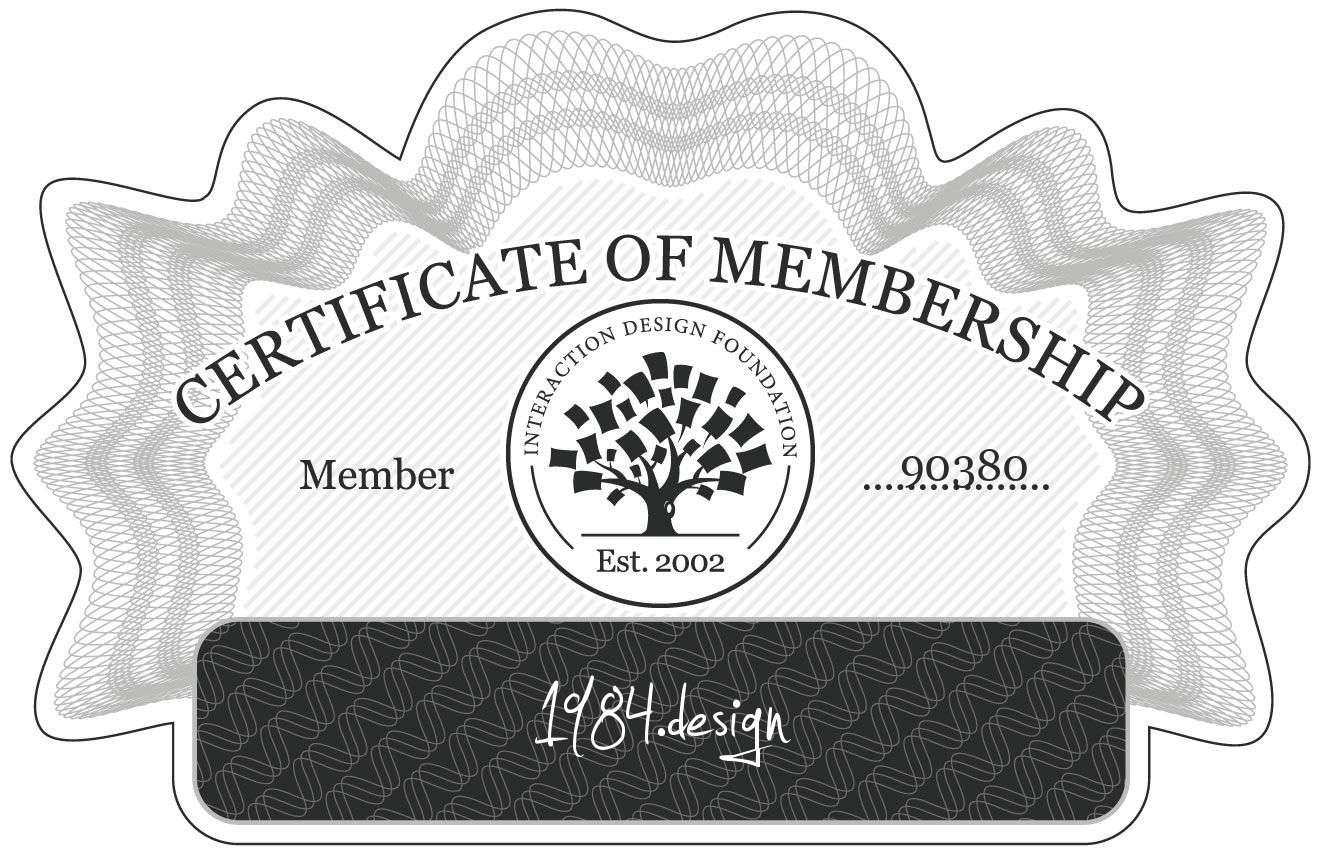
This Certificate of Membership verifies that 1984.design is a member of Interaction Design Foundation.