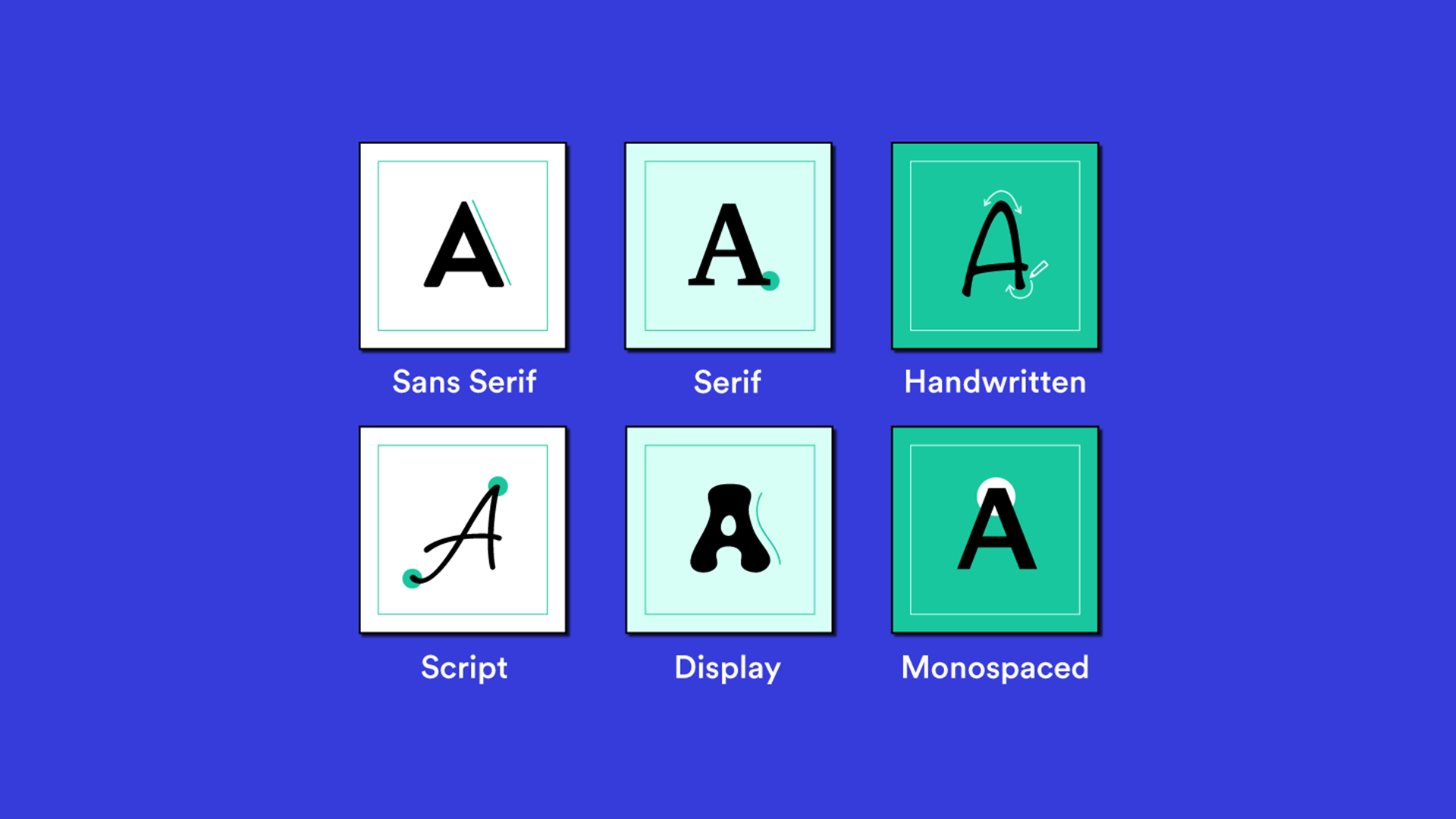
Font types

There are many types and classifications of fonts. Each of them has its history and origin. We are interested in those types of typefaces that work in user interface design, and there are several: Serif, Sans, Slab, and Mono.

All the others are too decorative and apply only with great care and a complete understanding of why.


It’s all about readability. This is the essential thing in user interface design. Readable text and quickly scannable headings indicate a suitable typeface. Decorative style and being unusual is also good if readability is still achieved.

Experiment with decorative fonts, such as for headings (with caution), to create an unusual and eye-catching design. However, using familiar typefaces for button labels, call-to-action links, and other meaningful text is better.

Most likely, the user of your interface will not have even a second to parse the letters in the decorative font and will ignore this caption, moving on to a more readable text or going away.

Where to use

Each type of font can be suitable for different tasks. Therefore, more often than not, the preference for a font type depends on the goals of your project and the desired result. But there are typical situations where one typeface fits and works better.

Sans

Use sans fonts wherever necessary. These fonts constantly scan and read well, especially in short headings and captions. It is a universal solution for UI design in any situation.


Sans typeface suits all cases but is best read in short headings and captions.

Serif

It is preferable to use serif fonts in interfaces where there will be a lot of text information, such as articles, news, and long reads. But this is not a dogma. Long text in sans font may be as readable as typed serif.


The serif typeface is always a good solution for reading long texts.


But using serif in controls, forms, and other components of dashboards and control panels is less preferable. As a rule, serif will be more challenging to scan and inconvenient for the user.

Slab

Use slab fonts mainly for headings. They work fine in this case. In texts and other interface components, slab typefaces read worse.

A slab typeface for the heading and sans-body text makes a great combination.

Mono

Use monospaced fonts to display code snippets or for short captions. It is best not to use mono font for the overall design or long texts. In this case, reading and scanning with the eye is not easy.


Mono typeface always looks fantastic as a decorative solution, bringing freshness and appeal to the design.


Experiment and test your choices. If in doubt, choose a familiar and proven solution.