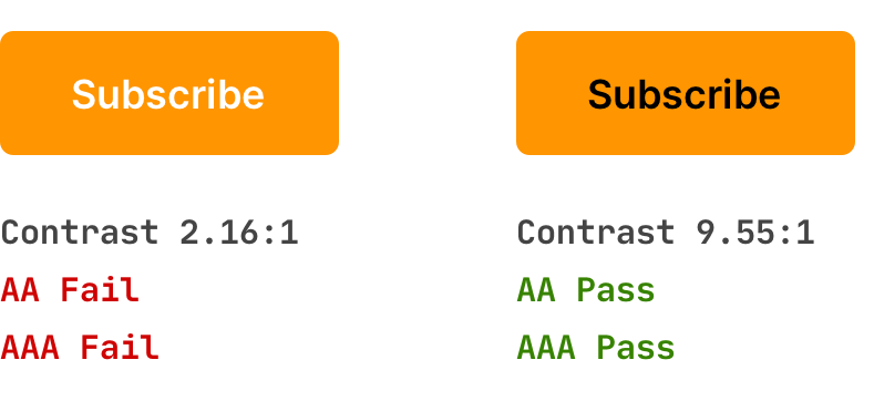
Sometimes, a problem with accessibility is visible to the naked eye. For example, when the text’s color is gray or yellow, it becomes illegible even with perfect eyesight.

You don’t need special tools to understand the problem when using a thin or light font, especially on dark backgrounds. Sometimes, it can be a regular typeface, but the font letters are too thin by design. Choosing a more readable typeface is better, and you should never use thin and light in your interfaces.

But often, you can’t do without special tools, and you can’t judge accessibility by relying only on common sense and good eyesight. In this case, it is better to test the contrast between the text and the background with accessibility checkers.

So, it is always better to check the choice of colors for text and backgrounds according to the WCAG recommendations and standards, especially on dark backgrounds. And test your decisions in color-blind vision simulators.
Even with exceptional vision, the too contrasting text is difficult to read. It is almost always a good idea to reduce the contrast of white text on a black background. With black text on a white background, you can make the background slightly gray or black text less black.

The best strategy is to think about accessibility before you start work. You can initially build your design and typography according to guidelines. You will always check your color and text size choices first. As a bonus, this will make your design more robust, cohesive, and balanced.
It’s worth paying special attention to the accessibility and adaptability of typography. Yes, it costs a little more of your time, and you may be unable to use a super bright text color on a too-light background because it’s so beautiful. But you will make a design that will be most comfortable for most people and pay off.
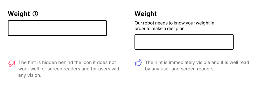
The accessible design includes many recommendations, such as alternative text for images, content readability for screen readers, unique markup tags, animation rules, contrast, etc.
When doing typography design, it seems more concerned for those implementing a website or an application in code. It would be best if you thought only about contrasting colors, and that’s enough. That’s not true because accessible design shows up in everything, making the whole interface more usable regardless of people’s differences.

By keeping accessibility in mind, you aim for an exceptional design that is great to read and use for everyone without exception.
