
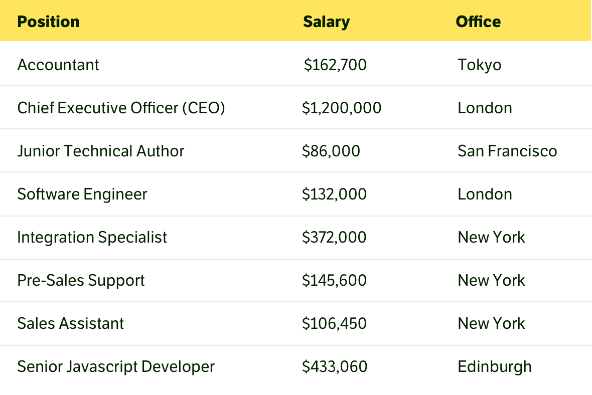
A table is an excellent way to show data for comparison and primarily numerical values. It raises questions about whether the table contains images, lists, headings, and other complex formatting on multiple lines.
The whole point of a table is to present the data in the best possible format for quick scanning and comparison. This can only be done if each table row has short one-line text and numbers.

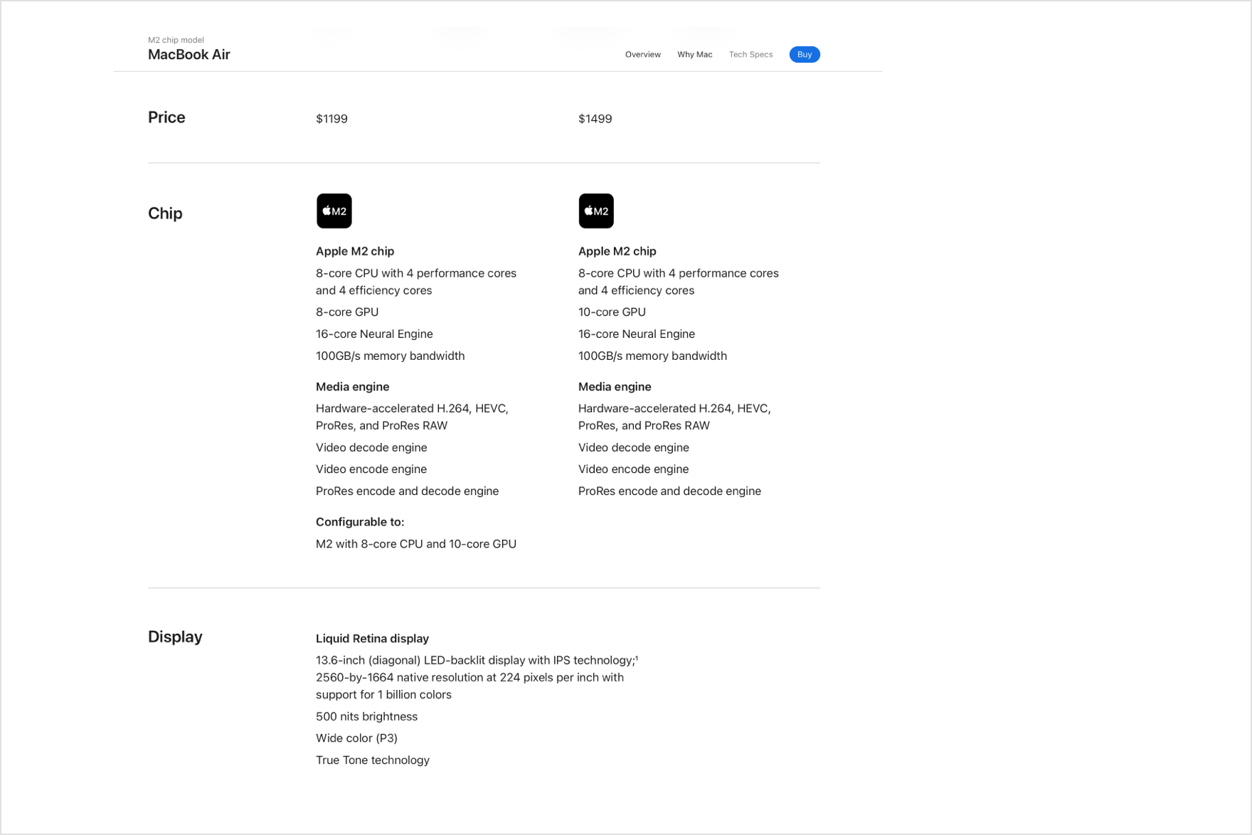
In all other cases, the table becomes unreadable, even if it has no formatting or images. Any long text or text in several lines makes the table awkward to read. If there is more than one line of text in a cell, you should consider a different data representation.

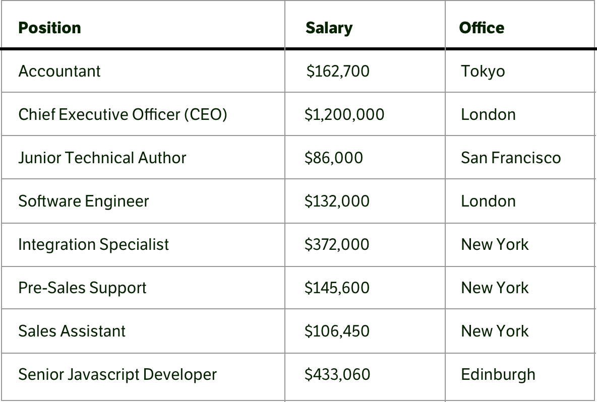
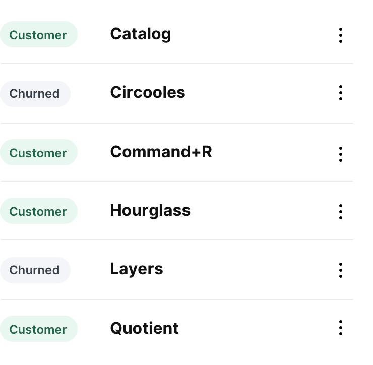
Borders in tables create noise and interfere with reading, especially if they are bold and contrasty. Users’ attention keeps shifting to the borders themselves, which causes the eye to jump from the data to them.
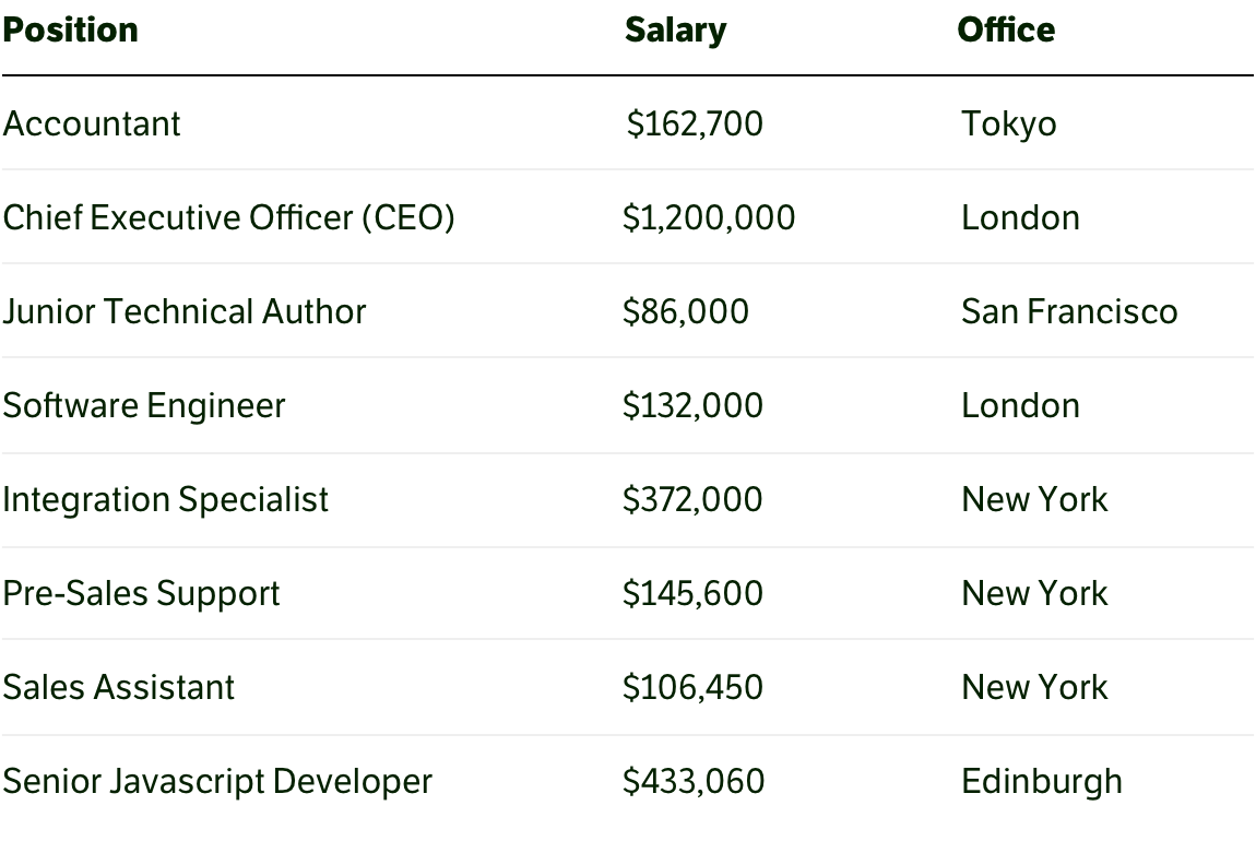
It is better to make the borders thin and light. Then, they will take on less attention. Vertical lines in tables are unnecessary; the rows and columns are perfectly readable without them.
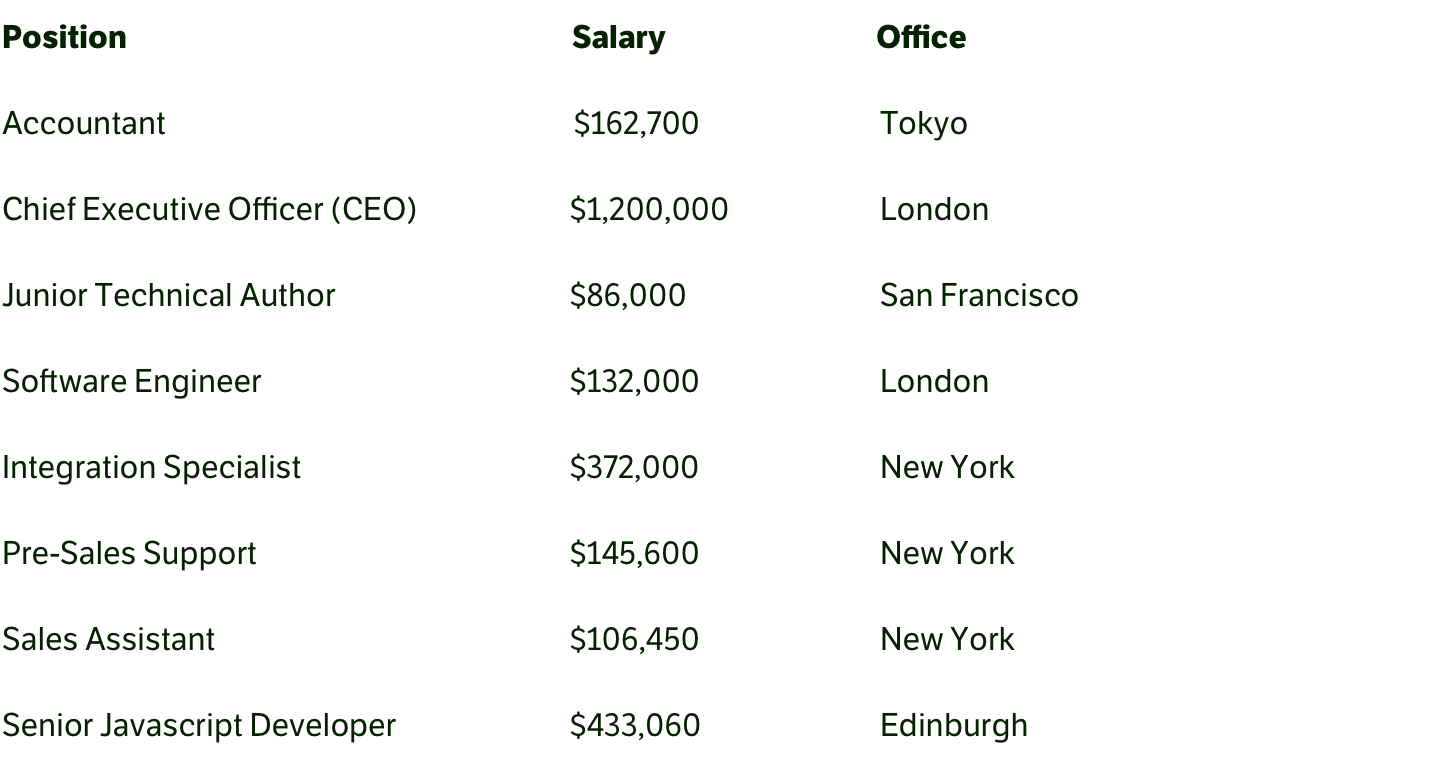
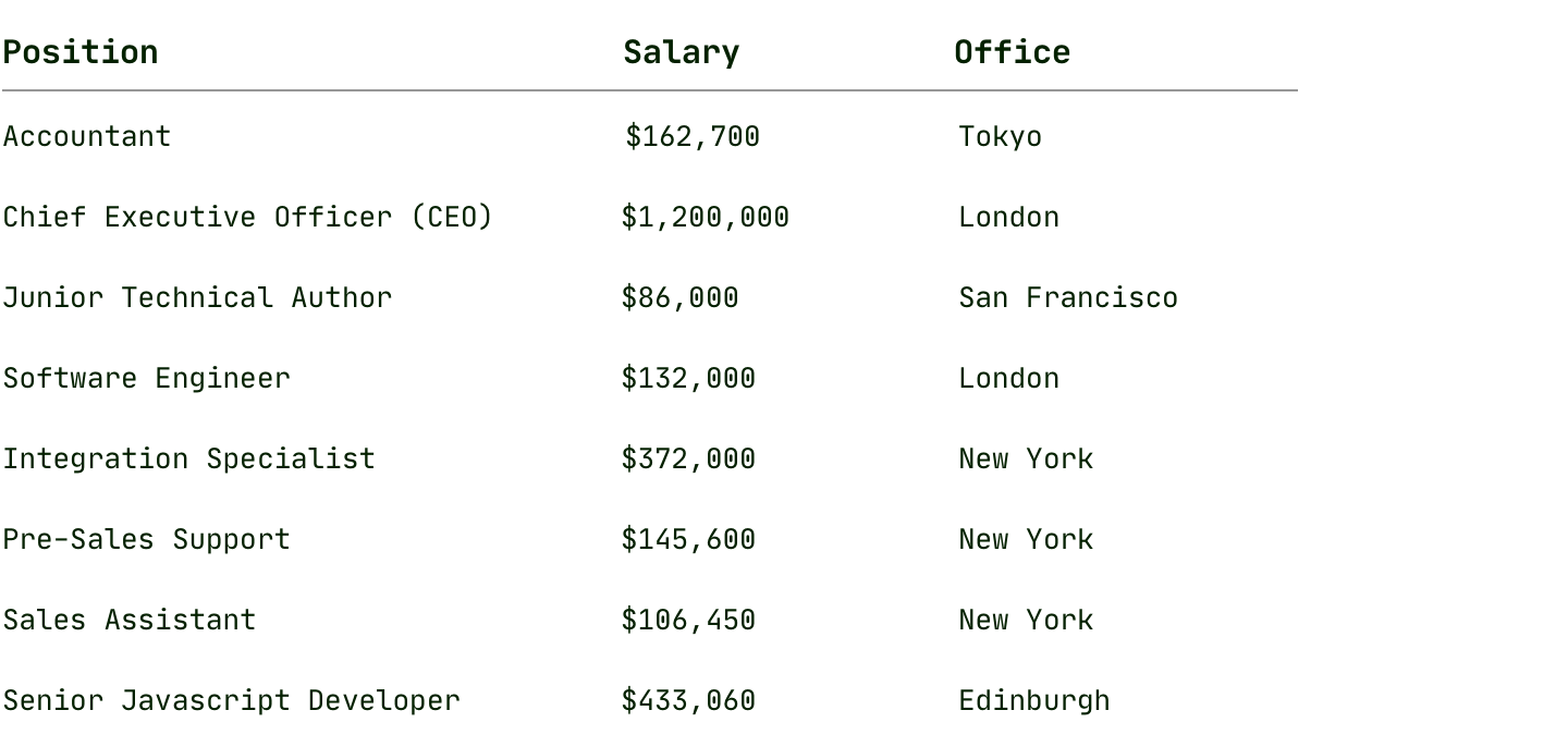
However, in principle, lines can be removed entirely from the tables. This does not interfere with reading the data but, on the contrary, makes the whole construction straightforward.
If the design goal is to make the table more accented among all the content, a good solution might be a background at the table header.
Another way to make a table stand out from its surroundings is to use a monospace font in it. This is beautiful and unusual and may even improve readability.
Zebra makes reading the table worse because the eye falls on the rows with dark stripes in the first place. Users have to strain hard to focus on the rows with no background.

A striped table is designed for wide tables when it is difficult to keep attention on a long row of data, and the background can help with that. In cases where the table is too long in height, stripes help to separate the rows visually, and the data does not merge into a solid spot. But a table that’s too wide or tall is always a bad thing and a sure signal that something is going wrong. It is better to think about other simpler and easier data presentations than to make huge tables and think of ways to read them better.
Generally, a chart is often better than a table and shows the data clearly and correctly, especially if these data need to be compared.
A chart simplifies and speeds up understanding, and the users do not have to analyze, compare, and build sequences in their heads. Therefore, it is often possible to discard unnecessary information from a table and present it as a chart.

The table is a big problem on mobile devices. There is almost never enough horizontal space on small screens, and the table tends to extend beyond the screen. The easiest way out is to make the table scroll horizontally on these screens. A more complicated option is to turn each table row into a separate table of two columns.

If your interface will work on screens of different sizes, it is worth immediately considering the behavior of the tables on them. Building the data on a grid and columns is probably better than selecting a table. This will help manage the appearance and create tables on different screens.
In dashboards and control panels, tables are used to manage data. Often, designers and developers go overboard with this and turn tables into overly complex structures with vast amounts of data and style.
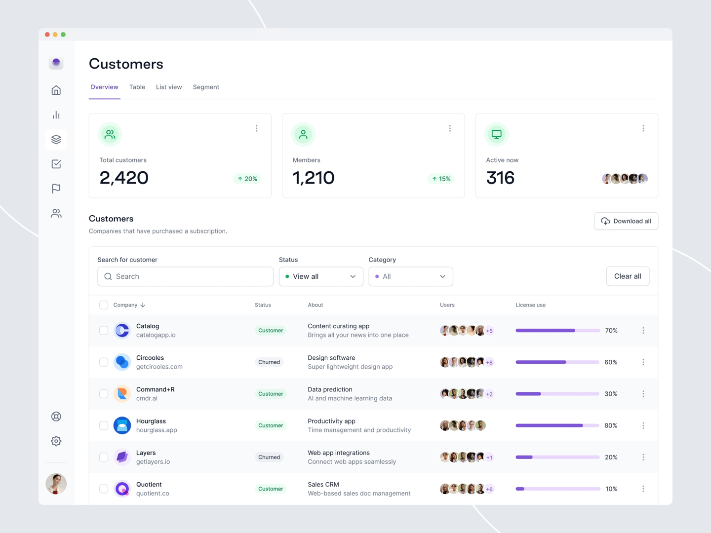
Such tables are overloaded with data, color, and images, and most of their information makes no sense. The principles and approaches to table design with data management differ from those used in the text. The lighter the table, the faster it will be read and more easily scanned. Therefore, it is worth discarding everything unnecessary and showing information more compactly.
For tables with data management, it’s better to do searches and filters so that when users search for something in a table and filter the data; you can show details and additional information in the cells in the results. That makes sense.
Simplification immediately solves the problem of displaying the table on small screens. A straightforward table with a minimum of columns is ready to display on mobile devices.