
Digital interfaces are full of text: placeholders, labels on buttons and navigational elements, helper text, instructions, CTAs, and so on. Unfortunately, those words carry no sense if they don’t speak to users and deliver the intended message. That’s why user psychology, UX design, and UX writing should always work together.
This doesn’t mean you need a degree in Psychology to understand users’ behavioral motives. Many pre-existing psychological experiments and studies are already around to help you. More importantly, you have your users — their behaviors, needs, motivations, and frustrations can speak louder than words.
For example, many of us believe that the more choice we have, the better. But have you ever found yourself wandering along the aisles of a huge supermarket and feeling lost among various products?
Surprisingly, the more options you have, the less likely you are to take action and select anything from this range. That’s why marketing emails offering a “Products you may like” section effectively lead users to purchase.
Types of psychology in UX writing
UX writing is never just a technical process. We write for users who have their motivations, expectations, biases, and cognitive limitations. Developing empathy toward users to understand their thoughts and feelings before they act is essential for creating a smooth digital experience.
This knowledge stems from behavioral psychology or behaviorism, born in the 1900s. This theory of learning is based on the idea that the environment shapes human behavior and that in the proper conditioning, you can influence the behavior of any person, regardless of their talents, abilities, inclinations, or other factors.
Many critics argue that behaviorism is too rigid and doesn’t consider free will and external influences like moods, thoughts, or feelings. However, its principles are still popular and help teachers and parents educate kids on acquiring new behaviors and discouraging unwanted ones. UX writers can also rely on behaviorism to guide people through digital interfaces.
In contrast to behaviorism, social psychology believes that human behavior is influenced by the actual presence of other people and social norms that affect us even when we’re alone. The principle of social proof originates from this.
Principles of cognitive psychology also find application in UX writing. They focus on understanding how people perceive and process information, how their memory works, what influences their attention, and other aspects of problem-solving, decision-making, and thinking.
Intuitive processes
The main goal of any designer is to create an intuitive interface. But what does “intuitive” mean? Does it have anything to do with intuition? What makes an interface intuitive?
First, intuition is the ability or power to know something is true without proof or evidence. It’s like a gut feeling that guides you to behave in a certain way without fully understanding why. Intuitive interfaces or processes have nothing to do with this ability.
An interface or process can be called intuitive when a person’s mental model matches a product’s conceptual model. In other words, a product is considered intuitive when it works exactly how a person expects it to work.
For example, before grocery shopping online, you have a mental model, an assumption about how this process looks like in real life. First, you go along aisles looking at available products. Then, you pick an item, put it in a shopping cart, and continue shopping. When you’re done, you go to the checkout, pay, and get a receipt.
When you first grocery shop online, your mental model adjusts to reality and shapes your experience. If you have no difficulties placing an order, the task has a low cognitive load, and the interface can be described as intuitive.
Understanding how users think and envision their flow is the main component of intuitive interfaces. From a UX writing perspective, the intuitive interfaces should talk to users in their language. Rather than using technical terms, you should listen to what your users say when discussing your product and apply this vocabulary to your interface.
Tip! Using plain language makes an interface user-friendly for all users across geographic boundaries, ages, and knowledge levels.
Generation of patterns
People are naturally drawn to patterns. Our brain resists change and always looks for the easiest way to accomplish a task. People often behave based on their prior experience; each time they face a new challenge, they search for patterns. For example, when we arrive at a website, we assume the menu will be on the page’s top or hidden inside a hamburger icon.
We expect things to look (UI patterns) and behave (UX patterns) in a specific way. When our expectations aren’t met, we feel disappointed and confused.
Regarding UX writing, designers should avoid making users learn new terminology. Each time you select a unique name for a standard button, you increase the cognitive load and time required for task completion.
Don’t misunderstand — each product is unique and has specific functionality. However, standard elements that users come across everywhere should behave similarly, be placed in a familiar place, and have common names. Jacob Nielsen explains this idea precisely: “People don’t want to spend time learning; they want to spend time doing.” So, for example, instead of naming the button “Appreciate post,” we say “Like,” or instead of “Make a purchase,” we stick to “Buy.”
Don’t make users think more than needed
One of the psychological heuristics formulated by Susan Weinschenk states that people don’t want to work or think more than they have to. Our brains are designed to be distracted due to survival mechanisms. The brain identifies things, labels them, and ignores them until they’re relevant again. Patterns of information and interaction help our brain activate the reactive system of human thought and decision-making. In contrast to the reflective system, it’s fast, automatic, and subconscious and doesn’t involve much thinking or making novel decisions.
When people can’t find quick and simple solutions and have to apply their logic and consciousness (analytical system) to accomplish a task in a system, they feel irritated and tend to abandon a product. What can designers and writers do to prevent this?
- Keep defaults upfront. Reduce cognitive load by ensuring the default settings and solutions are the most common for users. Additionally, you should follow the most natural reading patterns and place the most straightforward solutions upfront so that users don’t need to spend time and effort looking for them.
- Talk like users. UX writing should also contribute to faster identification of features. When you stick to users’ language and name features and elements with words they use, you activate the recognition process in human brains. Instead of straining their memory or making them think, you allow users to recognize words they have already used or seen in other interfaces.
Tip! Explore what drives users’ behavior when interacting with interfaces in the 10 Psychological Heuristics lesson by Susan Weinschenk.
Situational factors

People are social creatures, and their behavior greatly depends on other people’s reactions. We often act by looking to others for guidance on what they do, especially if we feel uncertain. This phenomenon is called social validation. By nature, we desire to behave “correctly” (in other words, like most people) under most circumstances — whether making a purchase, deciding where to eat, where to go, what to say, etc. But why does this happen?
According to social psychology, our behavior is a product of the situation (cultural factors, social roles, and the presence of other people) and the person (personal traits and temperament). Situationism is based on the belief that our environment and surroundings, including other people, shape our behavior.
This theory explains why customers rely on ratings, reviews, and testimonials. Seeing statements like “People also liked these items,” “What our visitors say about us,” or “Only 2 rooms are left” makes users trust the product or offering and feel more comfortable with making a decision or taking action.
Naturally, other components of the digital environment can influence users’ behavior. Detailed product descriptions, instructions, tips, notifications, and other details can also affect the situation and convince users to decide.
Construal principle

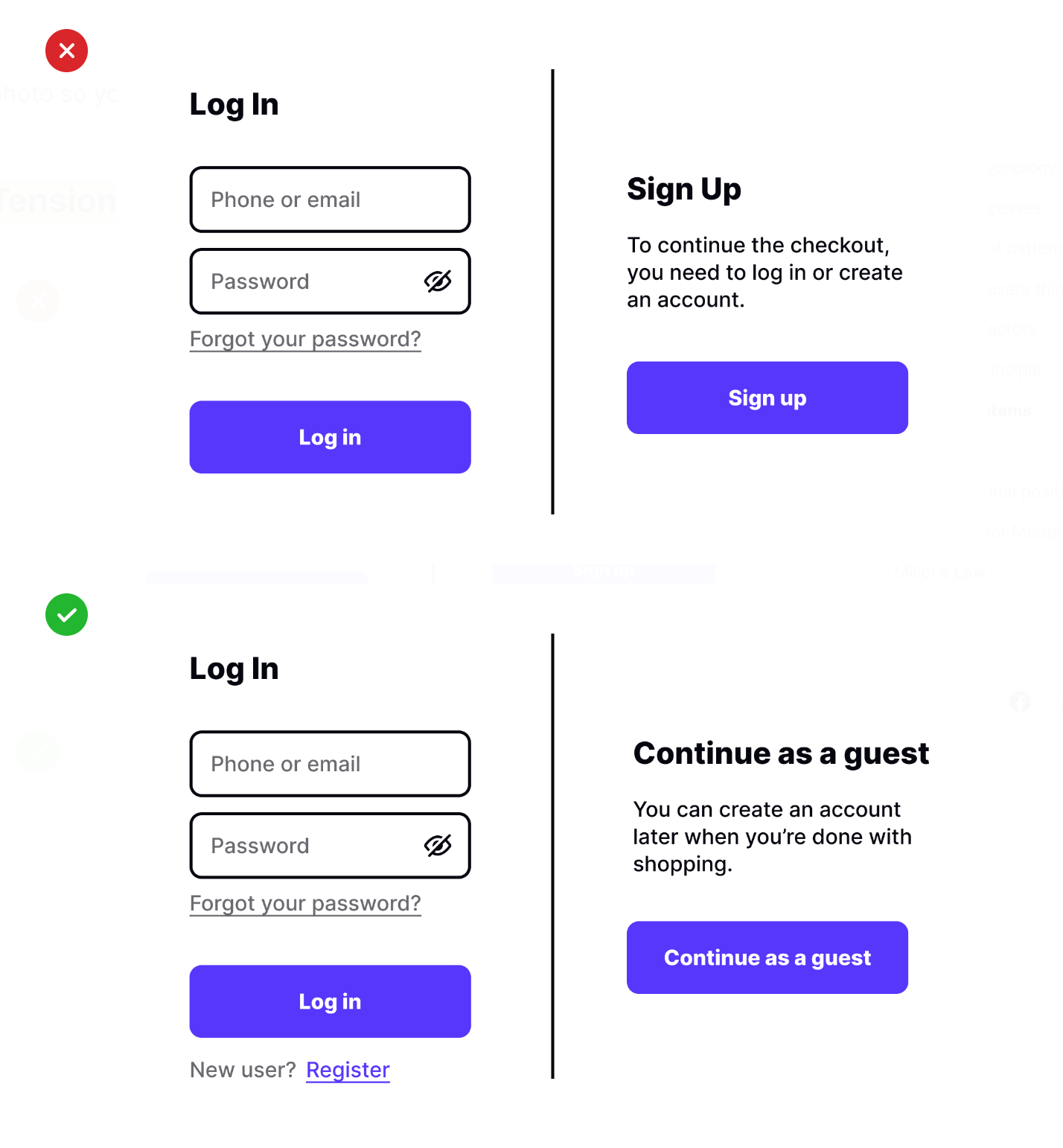
Loss aversion is a cognitive bias that describes why losing money or any other valuable object is more painful for people than gaining that same thing. In other words, people prefer not to lose $20 than to find $20.
What does it mean for UX writing? Like designers, writers should always put themselves in users’ shoes to understand how they perceive and interpret the situation. Your intentions may suit your company’s priorities, but if users don’t see value in them, they’ll ignore them. For example, you may say, “Add your photo to your profile,” or you can enhance the value of the action by saying, “Add your photo so your friends can find you faster.”
Tension systems
Psychologist Kurt Lewin developed a theory that human behavior consists of goals, barriers, drives, and psychological environments. Each time a person intends to achieve a goal, they encounter obstacles, and psychological tension is built. The tension is released when an individual completes the task.
For example, when users visit a website, they may feel highly motivated to buy a product (driving forces). But, when they’re suddenly asked to sign up at the checkout stage, it could create confusion, irritation, and doubt (restraining forces), impeding users from acting and achieving the goal. What can designers and UX writers do to solve this issue?
Studies prove that, sometimes, removing barriers is more likely to help people than adding extra incentives. So, instead of forcing users to create an account to buy products, provide them an alternative to leave their contact details for the delivery and pay without any extra effort. As a designer and UX writer, your goal is to detect potential barriers to action and eliminate them before users decide to leave.
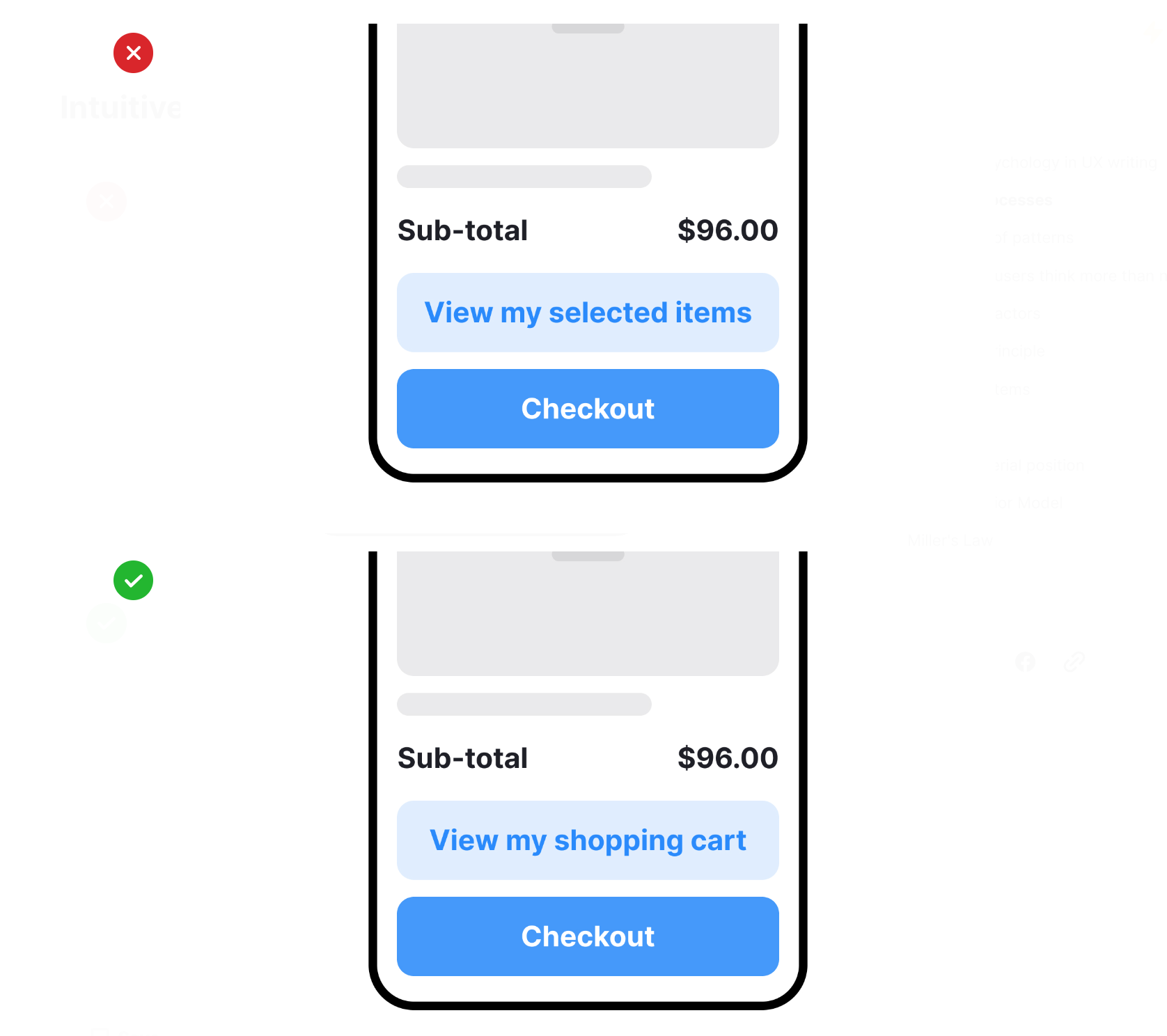
Hick’s Law

Hick’s Law or the Hick-Hyman Law is a fundamental UX law formulated in 1952. During an experiment, a team of two psychologists — William Edmund Hick from England and Ray Hyman from the United States — found out that the more options people have to choose from, the more frustrated and overwhelmed they feel, and the longer it takes for them to make a decision.
The fundamental rule of Hick’s law is to keep things simple. Wait, but don’t more choice options equal more freedom? The Jam Experiment conducted in 2000 proves the opposite. In the study, it was found that customers were more likely to buy jam from a booth with fewer options available.
More options cause cognitive load and choice paralysis, distracting users from their goals. Even worse — the more choices people have, the less happy they feel after purchasing. They tend to wonder if the other options might not have been a better choice and if they made a mistake. What can designers and UX writers do to solve this problem?
- Minimize choices. It’s especially vital for tasks when the time is limited and users have to decide faster. If you have more options, show the most common upfront and hide the rest behind the Show More button.
- Break down complex tasks into smaller steps. Breaking down a complex task, such as a form, into smaller steps and grouping content by topic decreases cognitive load.
- Highlight the most essential items. Use subheadings, color, and font weight to make the most common or essential options stand out.
Tip! Understand how the number of choices affects decision-making time in the Design Psychology: Hick’s Law lesson.
Effects of Serial Position
Imagine your partner asks you to go to the grocery store and buy a list of products: milk, banana, cookies, pickles, whole wheat bread, cheese, and peanut butter. According to the serial position effect, you’re likely to remember the first and last items but not the ones in the middle. If you haven’t jotted down the list, you will unlikely bring the pickles and whole wheat bread home.
The position of information in a sequence affects our memory, and we tend to remember the first and last items but have trouble recalling things in the middle. It happens because our brains need less processing power to recognize and memorize single items at the beginning. As the list grows, we need to process not just single items but a group of them, and it becomes a much more challenging task.
As for why we do so well with remembering the last objects on a list, we can easily recollect the most recent information we’ve heard or seen. In contrast to the first items that get into our long-term memory, the items at the end of the list hang out in our short-term memory.
In UX writing, always position the most vital elements at the list’s beginning or end and place the less relevant items in the middle if you want users to remember the sequence.
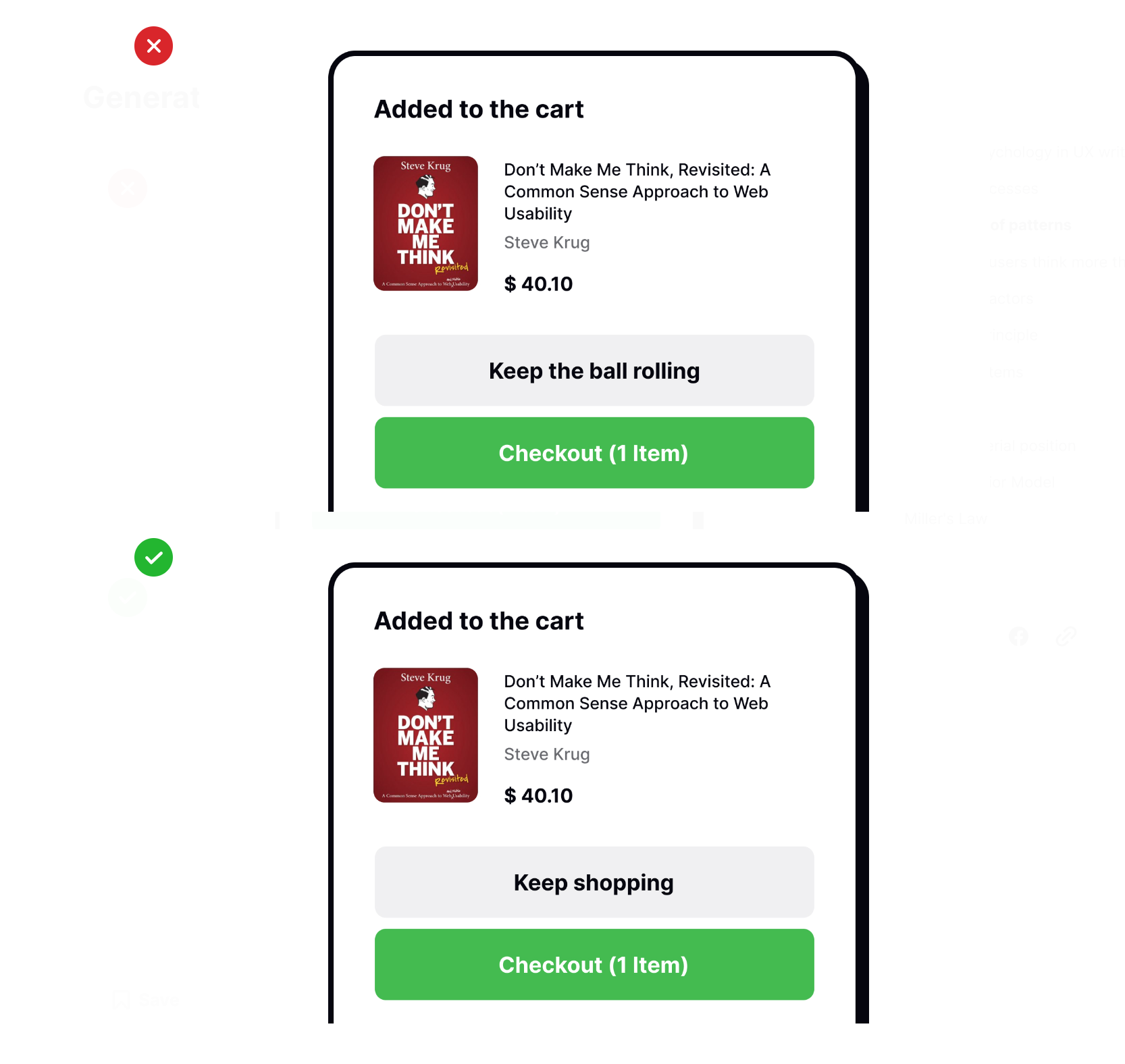
Fogg Behavior Model
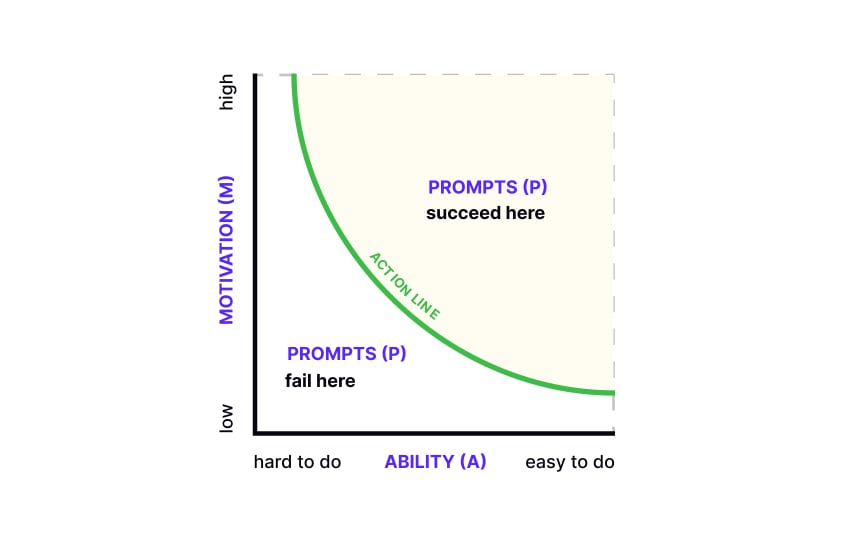
The Fogg Behavior Model helps us understand why people act as they do. It says that 3 things must be present for a behavior to happen: motivation, ability, and a trigger. If something’s missing, the behavior won’t occur.
Motivation helps users act:
- Physical: Basic human needs like pleasure or pain motivate us. For example, hunger motivates users to order food through a delivery app.
- Emotional: Feelings like hope or fear can drive actions. Buying medical insurance due to fear is an example.
- Social: The need to fit in makes us join social media or try new trends.
Ability is about how easy or hard a task is. The more complex a task, the more motivation needed to do it. If you want users to act, make tasks less complex rather than trying to increase motivation.
Triggers prompt action. A trigger can be a text or a call-to-action that makes users act immediately, like saying “limited collection” or encouraging them to join a free design course.
The cool thing is, these factors can make up for each other. For example, if you boost motivation, users might click a button even if its label doesn’t seem inviting.
To encourage users to engage in daily workouts, designers can add a feature to compare users’ progress with friends, for social motivation directly relates to the social motivator aspect of the Fogg Behavior Model, harnessing the power of social acceptance to drive user behavior.
Miller’s Law
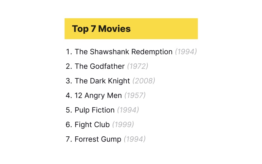
Many designers and UX writers have heard of Miller’s Law, but there’s a high chance they understood it too literally. Miller’s paper was recklessly used to justify that the number of related interface elements should be limited to the magical number of 7. People don’t need to memorize these items, so there’s no sense in using this specific number. So what is Miller’s law about then, and how does it influence UX?
The law originated in 1956 when cognitive psychologist George A. Miller published The Magical Number Seven, Plus or Minus Two: Some Limits on Our Capacity for Processing Information. Miller developed the idea of chunking and how it helps retain information more effectively. The expression of a “magical number 7” was mentioned only rhetorically in it. Miller proved that chunking makes the content easier to scan, comprehend, and identify. Eventually, it helps users achieve their goals much faster and more effectively.
Notably, the number of items in a chunk can vary depending on the context, familiarity with the content, and specific capacity.
Although there’s no magical number, Miller’s law teaches us the following:
- Group content into smaller chunks to help users scan, understand, and memorize it more effectively.
- Don’t overwhelm users with an extensive list of items; show the most relevant items first.
- Maintain visual hierarchy and avoid walls of text and clutter on a page.
- Consider the context that can influence individual short-term memory capacity.
Tip! Learn how to minimize cognitive load in design by exploring the 8 Design Tips to Reduce Cognitive Load lesson.

Build your UX career with interactive design learning, testing, and challenges.
- Guided, bite-sized lessons
- Gamified, habit-forming experience
- Shareable course certificates
- Real-life design challenges
- Skill assessments
- Mobile apps, available anytime & anywhere
Become a design Pro 4x faster with unlimited access. Follow our link to get 25% OFF on the Pro Yearly membership.
References
-
Why Behaviorism Is One of Psychology’s Most Fascinating Branches | Verywell Mind
-
The Secret to Designing an Intuitive UX | UX Magazine
-
Users Hate Change (Video) | Nielsen Norman Group
-
What is Cognitive Behavioral Therapy (CBT)? | Psychology Tools | Psychology Tools
-
Serial Position Effect – The Decision Lab | The Decision Lab
-
Laws of UX | O’Reilly Online Learning