
Lists are suitable for providing related data in logical lines, often with markers or numbers. A list helps to variety the text and the content as a whole. Using lists with beautiful markers as standalone modules in the design is excellent. They’re quick and easy to read, and they look pretty impressive.
Text-lists-relationship
A list in the text looks strange if it follows immediately after the title without preceding text or explanation.

It is always better if there is text or a description of what will be in the list first. This makes the structure of the text more meaningful and understandable.
Spacing
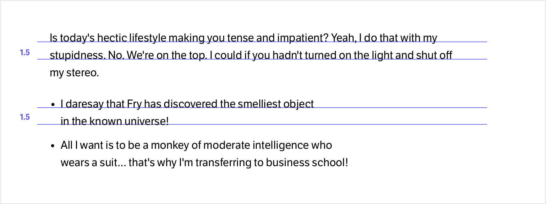
The list does not require special rules for the distance between it and the paragraph. On the contrary, a reduced or even more increased spacing between a paragraph and a list would be odd and unnecessary.
It’s best to keep the rhythm of the text and make the spacing precisely the same as between regular paragraphs. This doesn’t ruin the vertical rhythm, and the lists don’t break up the narrative.
Short lists look good without extra space between items. Even if the list has no markers, it is clear that the items are separate lines.
If the lists consist of two or more lines, making a sufficient gap between items is almost always better so that each item is separate and does not merge with the next.
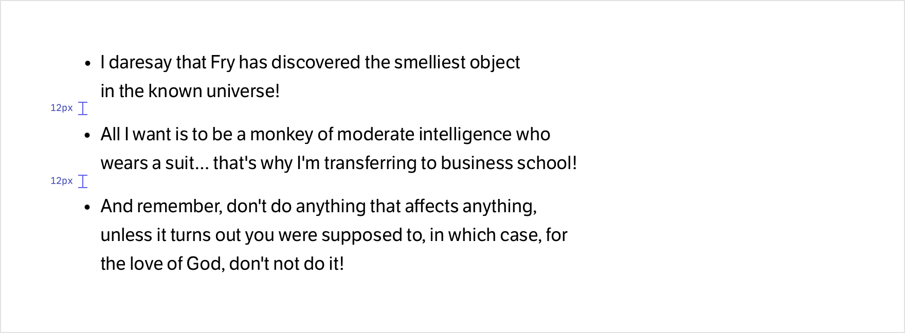
There is no reason to decrease the line spacing in list texts. Its value should be the same as in paragraphs. This preserves the rhythm and harmony of the entire text and the comfort of reading.
Markers
Numbered lists look much better if the items are in a circle with an accent color. This adds expression and attention to the list.

Decorative markers also work great in unnumbered lists. Adding extra focus points and drawing users in to read the information is a great trick.

But there’s nothing wrong with the classic bulleted list. It’s always the right solution, especially if the goal is not to distract users too much from reading the text.

Shifting the list to the right creates a variety of rhythms for long text. But in general, the offset is unnecessary, and the list can do just fine without it, especially if it has decorative and accent markers.
Unstyled
If you make a list without markers, as a rule, the list shift to the right is not necessary either. The list can do without the offset if it has short item lines and each item has a sufficient gap.

Lists without markers are best started with text that is in bold. This will better direct the user’s gaze and attention, making a list easier to read.

Features
A center-aligned list is always less readable than a left-aligned one, especially if the list items are long or have bright decorative markers.

A list with explicit headings can be a good solution and a great way to present information in a more varied and interesting way.

Don’t forget that lists can be in the text and as separate content modules in any interface. This makes the design more attractive and unique.
![]()
People like to read lists, especially short and concise ones. This way of presenting content is the most informative and quickest to understand and read.