The whole point of the design is to separate the primary from the secondary. In other words, focus users’ attention on the main thing to get to the action or find the information they need as quickly as possible.
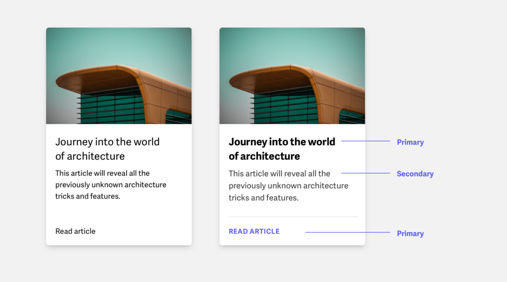
Typography is part of the design, and it follows the same principles. We work with content and present it in an interface so that the user understands what is necessary on the screen at any given moment, how to find the main thing, and what needs attention right now.
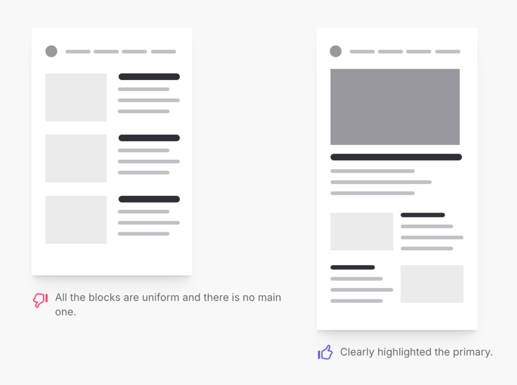
Good typography differs from bad typography in that users instantly understand what is necessary on the screen and omit the secondary until they need more detail. To achieve this is a real art and the highest class of designer.
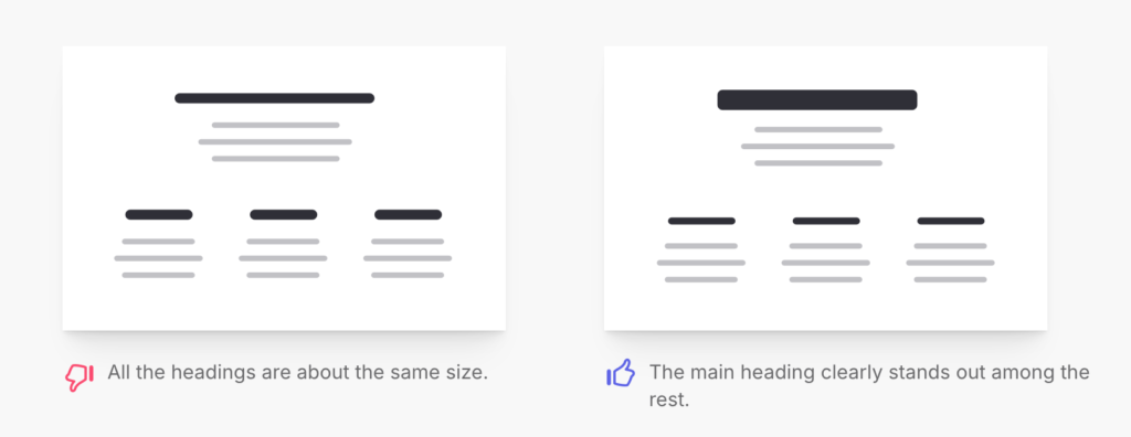
In user interfaces, the main things are headings, buttons, links, images, navigation, and controls. Secondary: text.
Sometimes, text is primary in content-oriented interfaces, such as news sites, book reader apps, documentation, and long reads. And in that case, the text is the most important thing; you have to put a lot of effort into it.
But in addition to content-oriented interfaces, there are countless other kinds of websites, applications, control panels, and different on-screen UI. The text has an auxiliary role, either a supplement to the main one or made for the robots. Unfortunately, the text on marketing sites is often for SEO, and no one reads it.
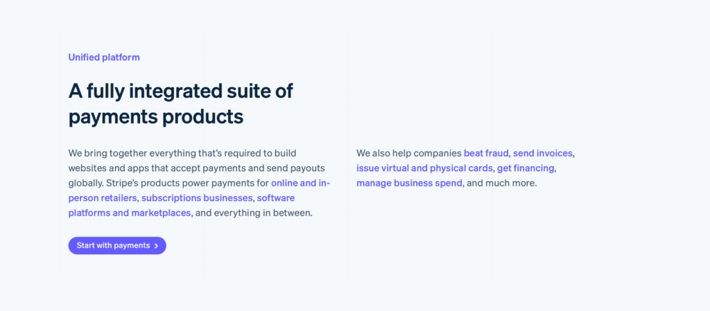
We scan the headings, scroll quickly, look at the images, and sometimes the icons. Then, we find a link or button and move on. It’s the same with control panels: we scan the headings, look for the button with the desired action, and move on.
By understanding how users interact with the interface, we know how to create focus points so they can get what’s important as easily and quickly as possible.

Separating primary and secondary makes the interface more user-friendly and helps users choose. Several tools and techniques in typography allow you to handle the relationship between primary and secondary. With these approaches, you can guide users’ focus and attention.
Shape
The shape can create an accent and attract attention with its distinction. The most striking example of such a trick is the icon. It always attracts attention and focus, increasing the chances that the user will read or at least scan the text next to the icon.

Sometimes, the shape can be pretty significant. It helps to create a focal point for the larger module.

Color
Color enhances attention, especially if it is bright and contrasts the surroundings. Color is also used for practical purposes, such as indicating links in the text.

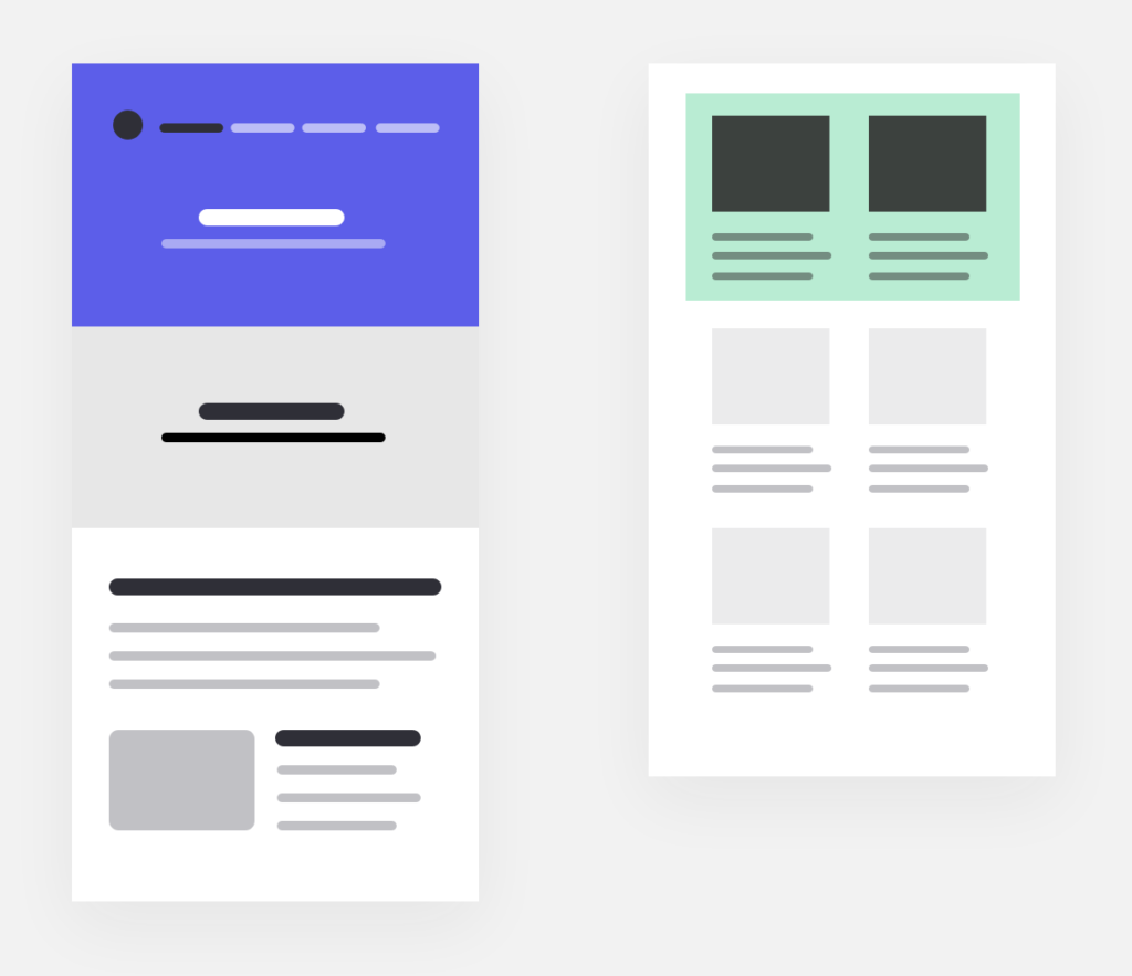
Color works not only in the text but also as a background accent. Highlighting the main block in the design with a background color helps users focus their attention and immediately see what’s important.
Size
A large title relative to text is a classic example of separating the primary from the secondary. The heading is what users need to see first. It has the most important appeal and helps draw users in and direct them to further action or information.

The size helps to highlight the primary in small components. The label in the form is the main thing. It helps to understand what data to enter. The hint below the input field is secondary; the user will not always refer to it.

Weight
The font’s weight helps direct the focus to what the user needs to see first. The secondary has less contrast, so a logical attention chain is built, with users first reading what’s in bold and then moving on to the clarification.

Mix
Using a mix of tools and applying several approaches simultaneously is possible. For example, the shape and color of the label make a great accent and help to attract the user’s attention.

Use different tools to separate the primary from the secondary in your design. Doing so will make the interface better and more user-friendly because you show immediately what is most important and where to start using the website or application.
