
Vertical rhythm is typography built with good contrast, hierarchy, and a balance of spacing between elements. An excellent vertical rhythm creates a sense of reliability, integrity, and design quality. An excellent vertical rhythm sometimes means the interface is based on a baseline grid when each line or element is bound to the height of the line spacing of the text.
The baseline grid does not automatically give harmony or create balance by default. It is a grid that only helps to make a design with a unified height dimension system. A proper vertical rhythm is achieved by the contrast and variety of elements, the repetitive spacing, and the harmonious relationship of those spacing.
The baseline grid is helpful mainly in mobile and desktop applications, where you can control the height of design elements and give them fixed values that do not change.
However, in responsive interfaces such as websites or screen size-dependent apps, the baseline grid is meaningless because elements such as controls, buttons, and images often cannot be set to the same height parameters. Therefore, there’s no need to use the baseline grid in these cases.
The best strategy for building a vertical rhythm is the spacing scale system based on a chosen unit and its multiples. This allows the creation of harmonious and predictable distances between text elements and gives the entire design harmony, balance, and integrity.
There are three most popular approaches to creating a spacing scale. Each has its characteristics and may work better in different cases.
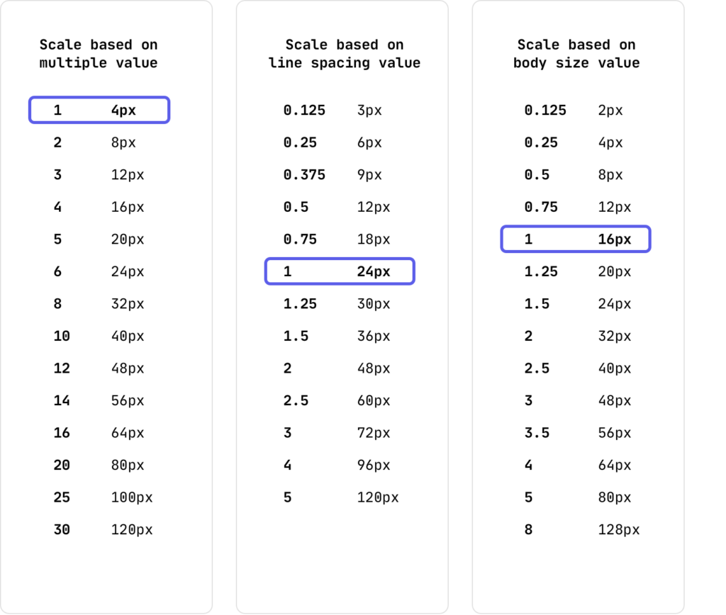
Based on the unit. You choose a specific number, such as 4px or 5px, and build a scale of multiples of that unit. This scale is convenient for any interface because it doesn’t depend on font sizes and line spacing. You can create harmonious distances in texts and modules like cards using this scale.
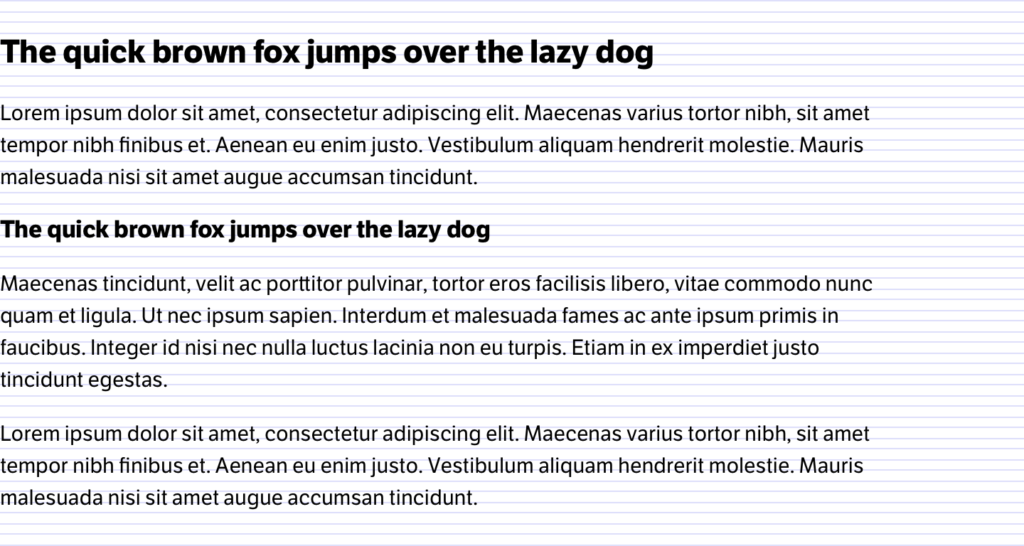
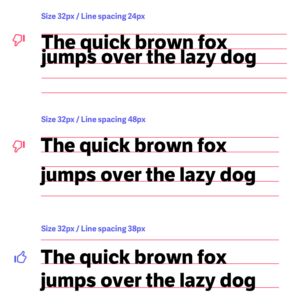
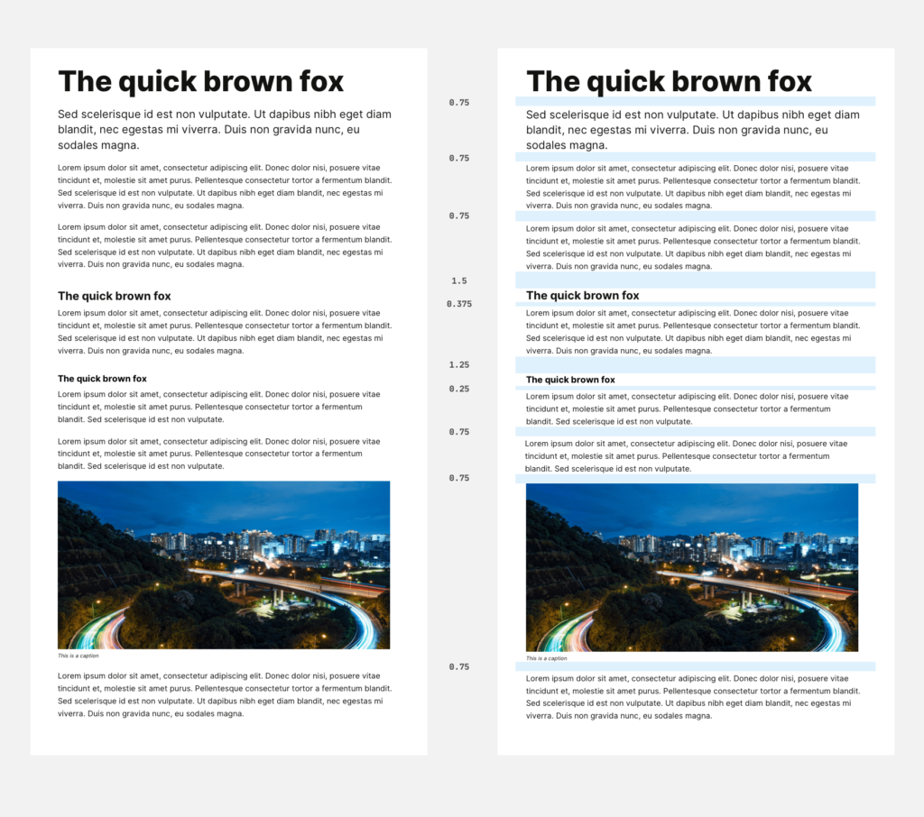
Based on line spacing. This scale is a multiple of the line spacing of body text. It is an ideal choice for building a harmonious vertical rhythm for articles, news, long reads, and content-oriented projects. Since the scale is built on line spacing, it automatically gives balance and rhythm. The line spacing provides a rhythm, and values from the scale repeat this value, which means the harmony will be as good as possible.
Based on the body font size. The most controversial scale is highly questionable in practice. The height of body text is not equal to its value in pixels and, therefore, has nothing to do with reality. Many modules will likely apply a non-body text size, so the scale values will have nothing to do with their text size.
Vertical rhythm is less important in interface modules like cards and other small forms. Contrast, grouping, and compositional techniques are more likely to work here. It’s worth paying more attention to the vertical rhythm for larger texts.
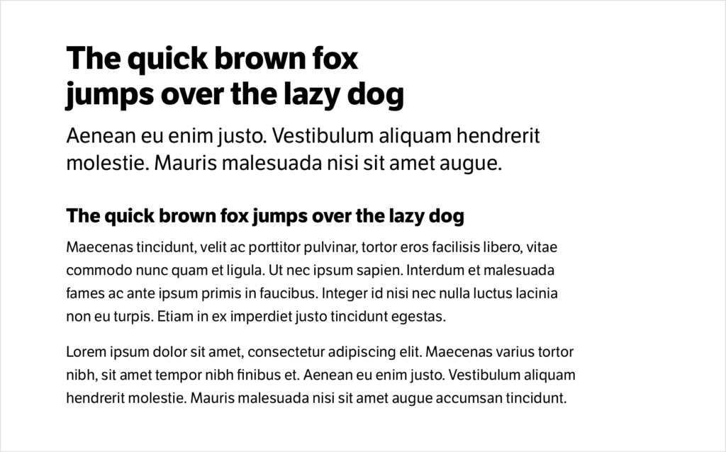
If you are making an interface that combines long texts and components with short captions and texts, you may need to use two different spacing scales. The body text size could be 21px on long reads, and the interface has 15px. These are other values to fit into a single spacing scale that will keep them balanced and systematic.
Using two spacing scales, you can create a good vertical rhythm for long texts (like documentation) and good spacing for small modules (like cards). The typography and design in both cases will be independent, and their spacing and size scales will not conflict.